Problem
The app "Roomie," designed to help college students find compatible roommates, is outdated. The company wants to redesign the platform with a modern interface inspired by dating apps like Tinder, hoping to attract more young adults who use similar platforms.
Solution
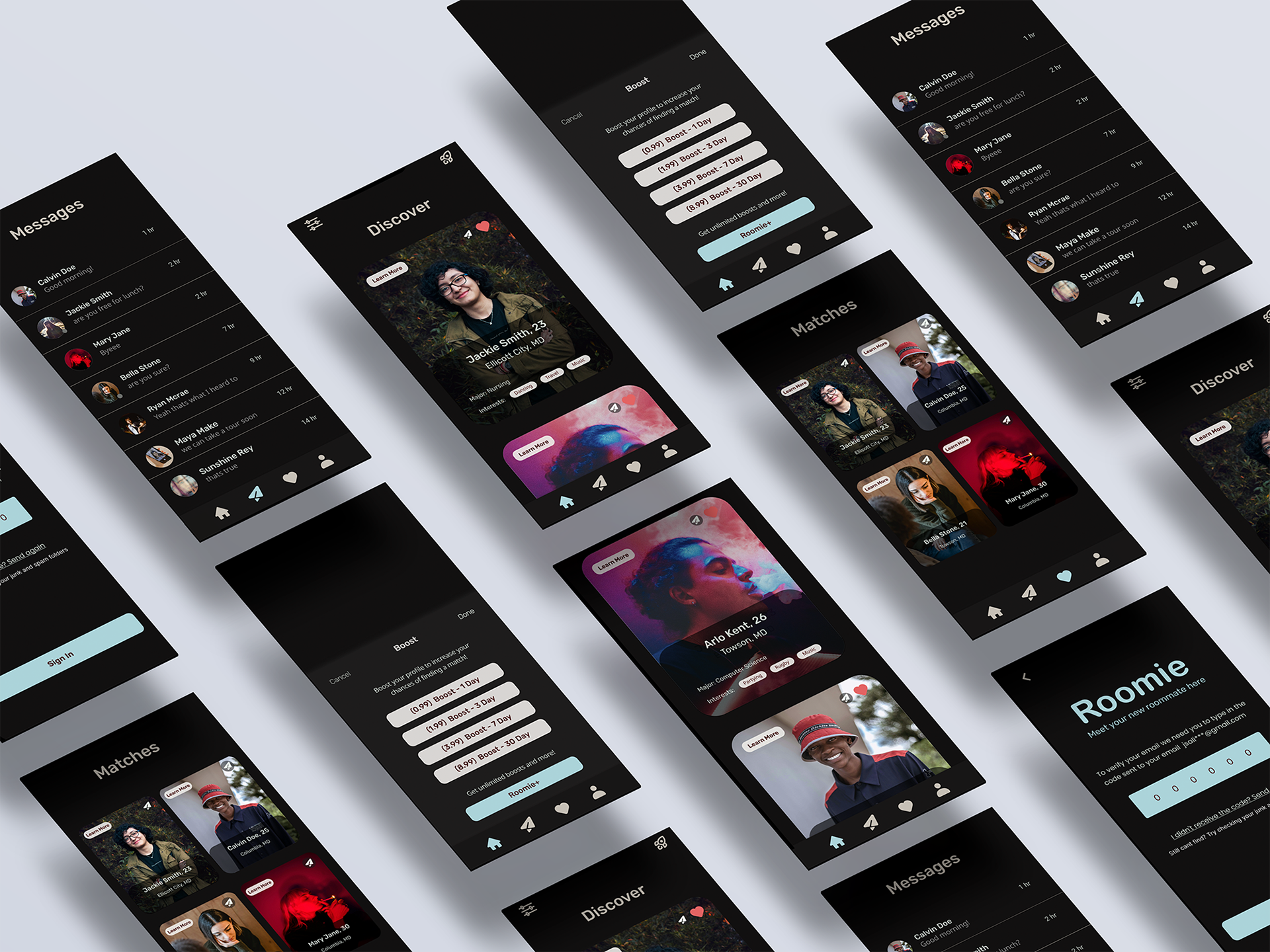
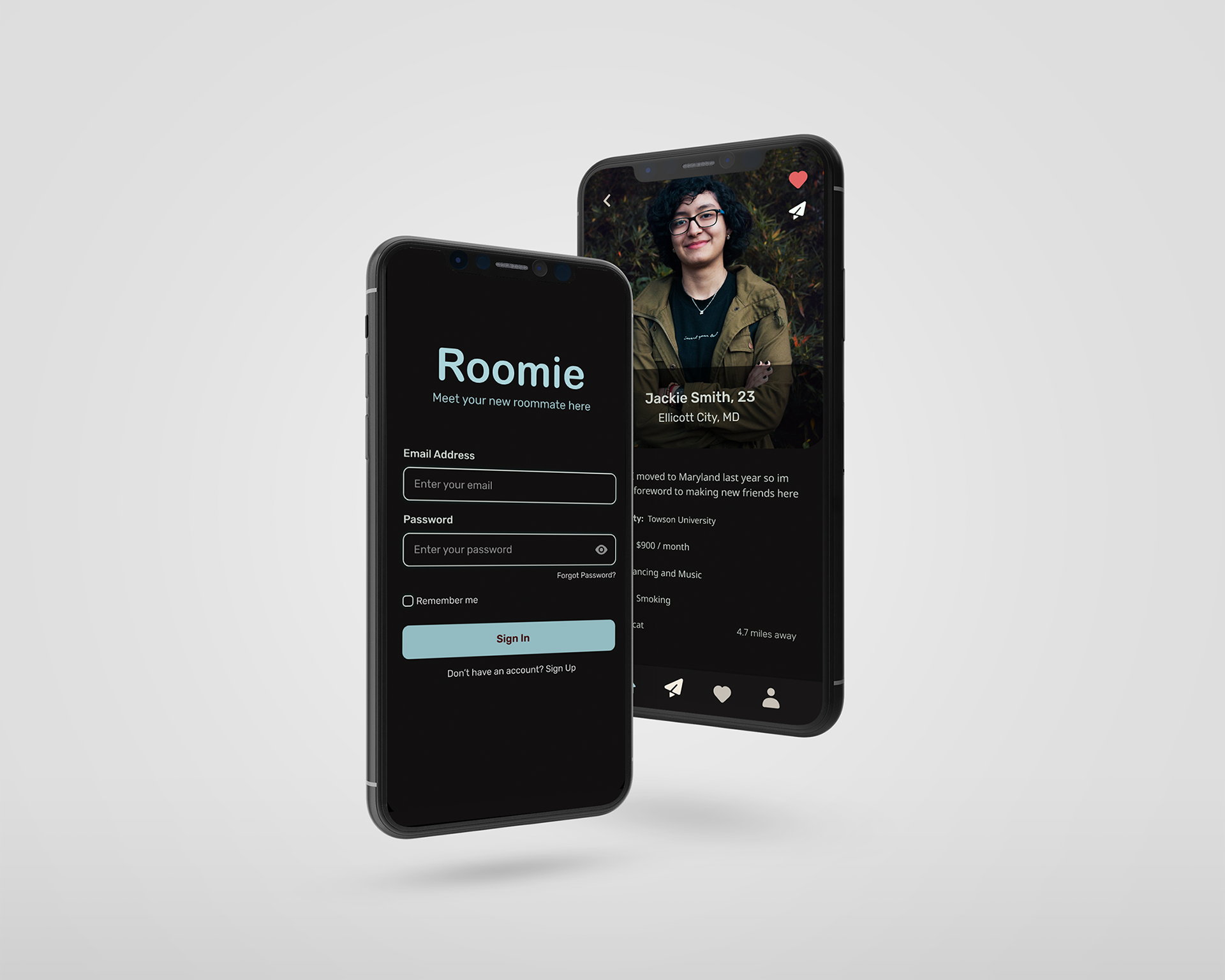
The updated "Roomie" app is designed to appeal to young adults by focusing on their preferences for finding roommates. Its homepage mimics the design of dating apps, allowing continuous scrolling through profiles. However, instead of rejecting others like traditional dating apps, users can show interest in potential roommates by liking their profiles, creating a more positive user experience.
My Role - UI/UX Designer
Tools Used - Figma, Photoshop
Duration - 3 weeks
What I did - User Research, Wireframing, Prototyping, Testing, Mobile App design
User Research
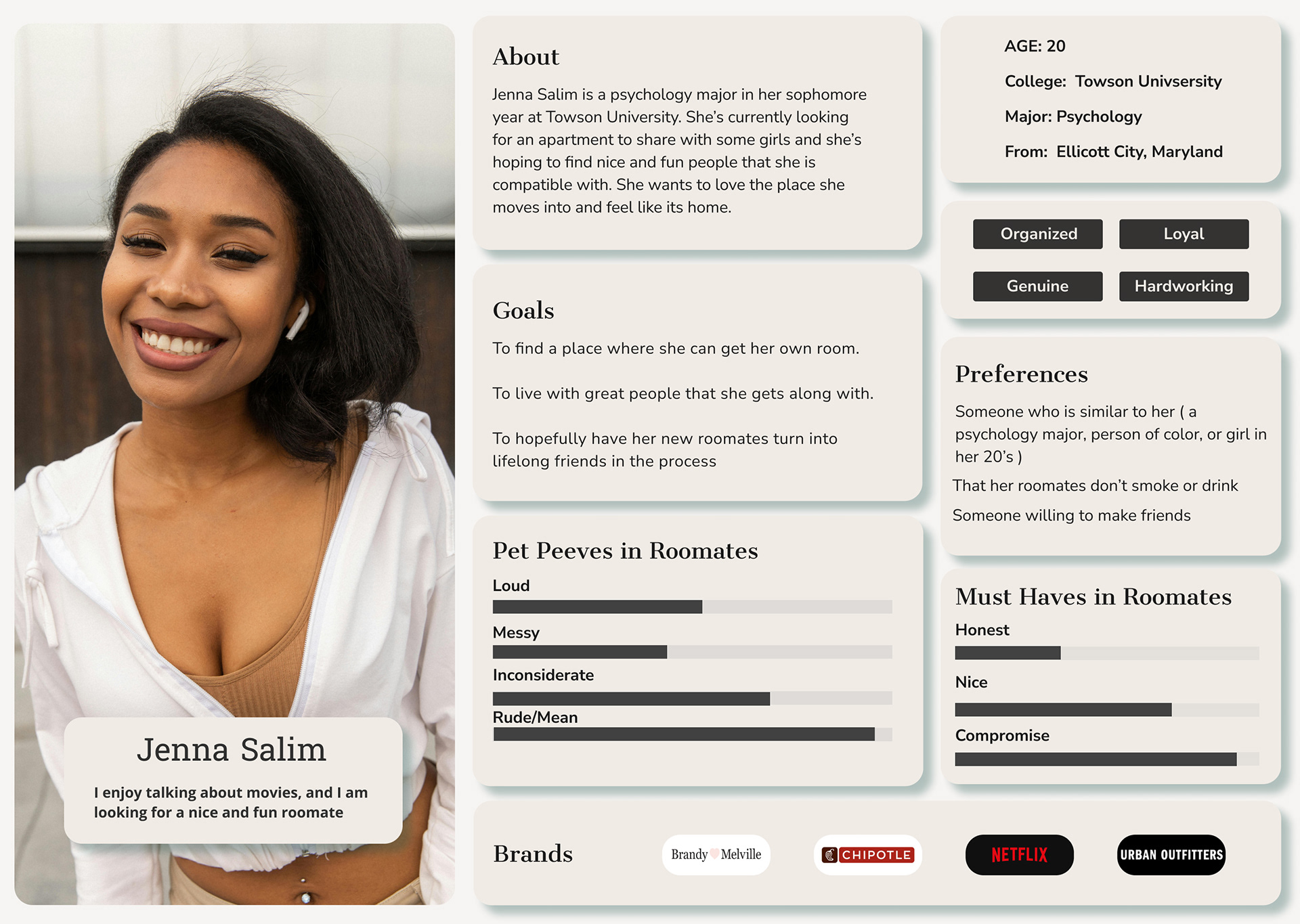
The target audience for this app is young adults aged 18-32. When searching for a roommate, they prioritize factors like shared interests, location, age, hobbies, majors, personality traits, race/ethnicity, and rent budgets. Common deal-breakers include smoking habits and pet policies. Based on this research, I developed user personas to represent the target demographic and highlight their key considerations when choosing a roommate.
Wireframes
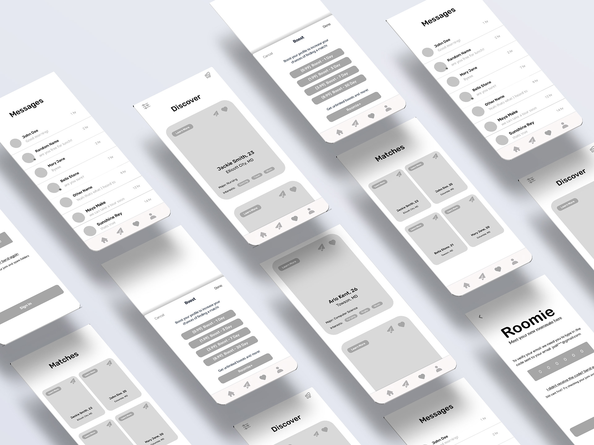
I designed the app to follow a similar layout to dating apps while focusing on the key factors college students care about when finding a roommate. Users can filter roommates by age, location, and distance. The app also displays important details like interests, majors, rent budgets, and any deal-breakers such as smoking or pets. These elements help prioritize the most relevant roommate information for users. Additional features include a sign-up page, a boost page to become a member, and a personal profile page.
Final Screens
I chose a black and light blue color palette to keep the app simple, uncluttered, and user-friendly. Key elements, such as the pink heart icon and important buttons like the sign-in and boost buttons in light blue, are highlighted for emphasis. This allowed me to prioritize functionality while maintaining a simple, distraction-free user experience.